go home bing weather, you’re drunk
"There is a special kind of UX failure that doesn’t crash, doesn’t throw an error, doesn’t even look broken."
There is a special kind of UX failure that doesn’t crash, doesn’t throw an error, doesn’t even look broken.
It just quietly lies to you.
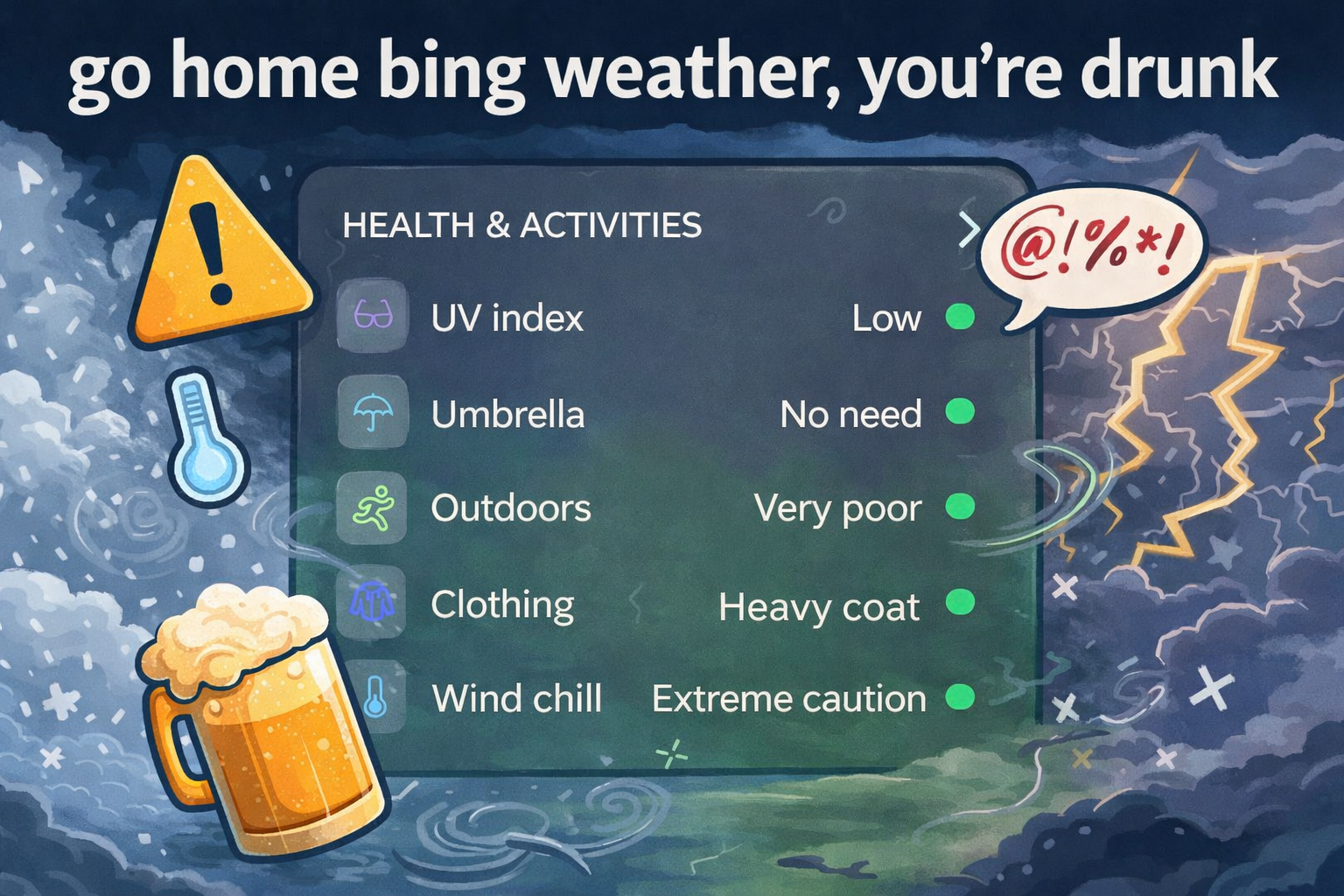
Exhibit A: Bing Weather’s “Health & Activities” panel.
At a glance, everything is green.
Green green green green green.
If you are a normal human being who has used literally any interface in the last twenty years, green means good. Safe. Go. All clear. You can frolic. You can skip. You can live your best life.
Except… read the labels.
- UV index: Low. Green. Fine.
- Umbrella: No need. Green. Sure.
- Outdoors: Very poor. Green.
- Clothing: Heavy coat. Green.
- Wind chill: Extreme caution. Green.
I’m sorry. What?
“Very poor” and “Extreme caution” are not green concepts.
That is not a color interpretation issue. That is not subjective. That is not vibes-based UX. That is just wrong.
The problem is not the text
Defenders will say, “Well, the words are there.”
Yes. They are. In small text. Off to the side. Competing with five other pieces of information. On a panel that visually screams everything-is-fine.
Users do not parse dashboards like legal contracts. They scan. They rely on hierarchy. They rely on color. They rely on iconography. They rely on patterns they have learned across thousands of interfaces.
Green means safe.
Red means stop.
Yellow means caution.
This is not controversial. It is muscle memory.
When every indicator dot is green, the system is communicating a single message: you’re good.
But the content contradicts that message.
“Extreme caution” in green is like a fire alarm that whispers.
Cognitive load is real
Good UX reduces cognitive load. It makes the correct interpretation effortless.
Bad UX forces reconciliation.
Here, the user has to do extra work:
- Notice the green.
- Feel reassured.
- Read the text.
- Realize the text contradicts the color.
- Mentally override the color signal.
That is friction. Unnecessary friction. In a weather app.
And weather is not trivia. It informs what you wear. Whether you drive. Whether your kid waits outside. Whether frostbite is a possibility.
If “wind chill: extreme caution” is green, what does red even mean? Apocalypse?
The iconography is lying
Color is not decorative. It is semantic.
If the dots are purely aesthetic, remove them.
If they are semantic, they must align with severity.
Right now they function as a visual rating system. And they are misrating reality.
- Outdoors: Very poor
- Clothing: Heavy coat
- Wind chill: Extreme caution
Those are at minimum yellow and red states. The visual system should escalate urgency in parallel with the language.
Instead, the UI flattens everything into cheerful neutrality.
That is not just sloppy. It is misleading.
UX matters because trust matters
Interfaces teach users whether they can rely on them.
When the visual layer contradicts the textual layer, trust erodes. Subtly. Quietly. Repeatedly.
The next time a warning appears, does the user believe it? Or does it blend into the sea of green reassurance?
Design is not about making things look tidy. It is about making meaning obvious.
If the weather conditions require extreme caution, the interface should not look like a wellness checkmark parade.
Bing Weather, respectfully:
Go home.
You’re drunk.
And maybe let someone who understands color semantics drive the dashboard.