humour
Crocodiles Do Not Swim Here
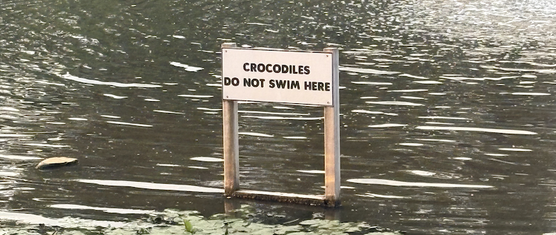
"I was walking in Amsterdam yesterday with my family when we came across the sign above."
I was walking in Amsterdam yesterday with my family when we came across the sign above.
We stopped, we read it, and then we stood there for a solid two minutes trying to figure out what the sign was actually attempting to communicate. Because that same string of two lines, depending on where you mentally insert punctuation, is capable of at least three completely different meanings, and they are not all reassuring.
Reading number one: "Crocodiles do not swim here." The straight-through, no-punctuation, reassuring interpretation. This is a canal in the Netherlands, there are no crocodiles, please relax and enjoy the ducks. The city has posted a sign to preemptively soothe any traveller who has spent too much time in Australia.
Reading number two: "Crocodiles! Do not swim here." Same characters, one implied exclamation mark, wildly different vibe. The sign is now urgently warning you that there are, in fact, crocodiles in the water, and you should not swim there under any circumstances. Suddenly the lily pads are less charming. Are those ripples? Why are those ripples?
Reading number three: "Crocodiles: do not swim here." With an implied colon, the sign is now addressing the crocodiles directly, presumably in the same language humans use, respectfully requesting that they take their business elsewhere. This one is my favourite. It presumes not just that there are crocodiles, but that they are literate, cooperative, and willing to accept municipal signage as binding guidance.
Three plausible readings. One sign. No punctuation. The Netherlands is a country that produced some of the cunningist linguists in Europe, and this one sign has apparently defeated all of them.
I've made this point before
I have written before about how language matters, and how the absence of small details in phrasing can create genuinely funny (or genuinely expensive) misunderstandings. And separately about how Bing's weather app was, for a while, describing conditions in a way that made the city of Toronto sound like it had been overrun by fog gods. The Amsterdam crocodile sign is another entry in the same file. Ambiguous phrasing is fine when the stakes are low. It becomes a design failure the moment a small child looks up at the sign, tries to parse it, and asks their parent whether they can swim in the pretty canal.
The version of the sign that would have done its job unambiguously is not exactly heroic engineering. "Warning: no swimming." Six characters less than the current sign uses, and it removes all three ambiguities in one go. If the Netherlands genuinely wanted to warn about crocodiles, presumably a picture of a crocodile would have been a nice touch, given that pictograms are a whole thing in signage precisely because they route around the problem of which language the reader speaks. If the Netherlands genuinely wanted to reassure people that there are no crocodiles in this specific canal, they should not have led the sign with the word CROCODILES in large friendly letters, because CROCODILES in large friendly letters is not a reassuring sight in any language.
Words are cheap. Punctuation is free. Both of them do actual work in the world, and every so often you see a sign, a policy document, or an error message that reminds you exactly how much work they do when they are present, by virtue of what happens when they are absent.
I did not swim in the canal. I am not sure whether that is because the sign successfully warned me, or because it successfully lied to me, or because the crocodiles received their instructions and complied. Amsterdam is a mystery.
But if I ever come back and see one of them sunning itself on the bank, at least I will know it was a native speaker.