Leadership
The Museum of Meaningless Metrics
"I came across a cartoon on LinkedIn this week."
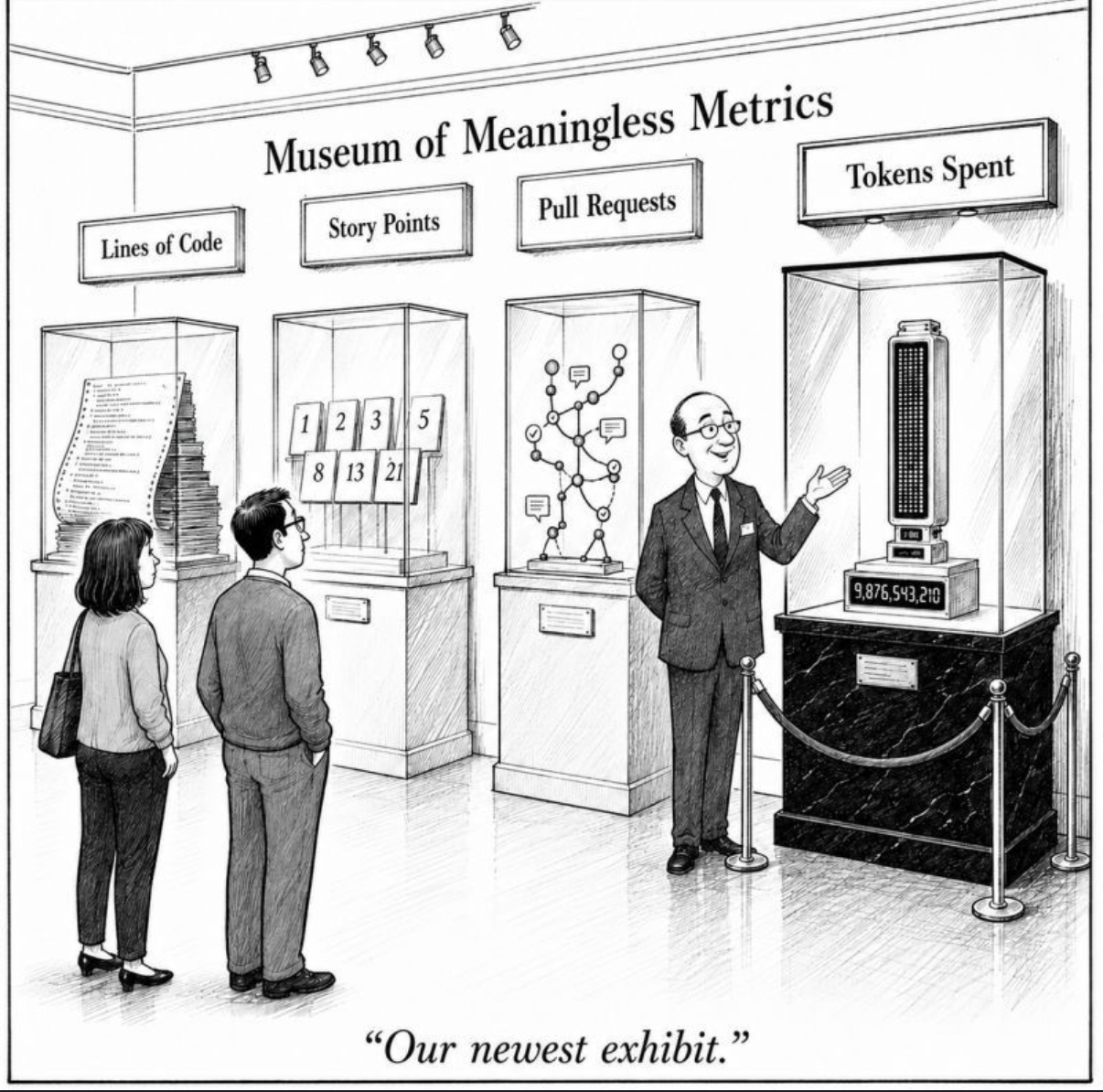
I came across a cartoon on LinkedIn this week. A small museum gallery, four glass cases on plinths. Lines of Code, with a tall stack of fanfold paper inside. Story Points, with a Fibonacci sequence of cards. Pull Requests, with a tangle of dots and arrows. Tokens Spent, the newest display, a digital readout flashing 9,876,543,210. A docent gestures at the new exhibit. "Our newest exhibit" reads the caption.
It is a perfect cartoon, because every IT manager in the world has spent some chunk of their career trying to manage by at least one of those four numbers, and every IT worker in the world has spent some chunk of their career figuring out how to make the number say what the boss wanted it to say.
This is, as it turns out, a very old problem.
The cobras of Delhi
For those not familiar with the cobra effect, the story goes that the British colonial government in India was alarmed by the number of venomous cobras in Delhi and announced a bounty for every dead cobra brought in. For a while, this worked beautifully. Cobra numbers fell. Then someone noticed that enterprising locals had started breeding cobras specifically to collect the bounty. When the bounty was cancelled, the now-worthless cobras were released back into the wild, and the city ended up with more cobras than it had started with. The metric had moved. The outcome had not. The outcome, in fact, had gotten worse.
That story is the patron saint of every dashboard you have ever built. It is the parable behind every quarterly review where the numbers were green and the customers were still leaving. The cartoon at the top of this post is just the modern reboot, set in a museum instead of a market.
Management is not wrong to want visibility
I want to be clear about something before I start dunking on dashboards, because the dashboard backlash gets carried away on the internet and ends up sounding like it is opposed to measurement itself. It is not.
A manager with fifty direct or indirect reports cannot personally inspect every ticket, project, or decision. Of course they reach for metrics. They need some way to understand who is keeping up, who is struggling, where the bottlenecks are, and whether the organization is improving over time. Dashboards and KPIs are attractive because they scale, they look objective, and they fit on a single screen in a quarterly review. That is a legitimate problem and dashboards are a legitimate response to it.
The trouble is not the existence of measurement. The trouble is what gets measured.
Most operational metrics are not the thing the business actually cares about. They are proxies for it. Ticket closure time is a proxy for responsiveness. Pull request count is a proxy for engineering output. Story points completed are a proxy for delivery. Vulnerabilities closed are a proxy for security improvement. Patch compliance is a proxy for risk reduction. None of those numbers is the thing. Each of them is a number that correlates, more or less loosely, with the thing, under the assumption that everyone involved is acting in good faith and not specifically optimizing for the metric.
The moment a proxy gets attached to compensation, performance reviews, or prestige, that assumption breaks. People optimize the proxy. Sometimes consciously, sometimes not, but they do it. And the gap between the proxy and the actual outcome quietly widens until the dashboard is glowing green and the underlying reality has not moved.
The pivot I want to make is this: if a metric can be improved without improving the outcome, it is a dangerous thing to manage people by.
Three IT classics, three ways to make the dashboard lie
For those not familiar with how this looks in the wild, let me walk through three specific examples that anyone who has worked in operations for more than a couple of years will recognize on sight.
Mean time to close tickets. A classic. The number is supposed to mean "we are responsive to our users." The number actually means "how long the ticket spent in a state we tracked." So you put the ticket into a Pending customer state to stop the SLA clock, even when the customer is not actually blocking anything. You close the ticket with the deeply useful resolution note "monitor and reopen if issue persists." You split one nasty incident into three smaller tickets so two of them can close fast. By the end of the quarter your mean time to close is gorgeous. By the end of the year your users have figured out that the way to get something fixed is to open a ticket, wait a week, escalate to their VP, and never trust the dashboard.
Change success rate. This one is supposed to mean "we are running a disciplined operation that ships changes without breaking production." The number actually means "the percentage of things we called changes that we also called successes." So risky changes get pushed through as informal hotfixes that never hit the change board. One large change gets broken into seventeen tiny "safe" ones, sixteen of which sail through and one of which gets quietly logged as an incident rather than a change failure. The change board's reporting line shows 98% green for the third quarter running. The actual underlying risk is exactly where it was before, just relocated to a column that nobody is reviewing.
Vulnerability remediation. This one is my favourite, because the gaming is so brazen. The number is supposed to mean "we are reducing our security exposure." The number actually means "the count of CVE-flagged items that the scanner is currently flagging." So you change the severity from high to medium on the items you do not feel like fixing, because medium-severity items do not appear on the executive dashboard. You file a risk acceptance exception. You tune the scanner to suppress duplicate findings. You decommission the scanner on the hard-to-fix legacy hosts entirely, on the principle that what cannot be measured cannot be vulnerable. The vulnerability backlog shrinks. The exposure has not. The auditor signs off. Six months later somebody phishes their way into the unscanned legacy box and the company gets to issue a press release about how seriously it takes security.
In every one of these examples, the metric is being honestly produced by the system that was asked to produce it. The system is doing exactly what was demanded of it. The fact that the underlying outcome has not moved is, from the dashboard's perspective, not a bug. It is not even visible.
The engineering version: pull requests
Engineering has its own dialect of this disease and the most common one is the pull-request count.
Imagine the real task is, "add a new greet(name) endpoint that returns Hello, name and includes tests." A healthy engineer ships this as a single PR. New route, new service logic, unit tests, a line in the API docs. One coherent, reviewable unit of work. Call it PR #142.
If management is tracking PRs opened per engineer per week, the same task can become PR #142 (empty GreetingService class), PR #143 (GreetingRequest DTO), PR #144 (GreetingResponse DTO), PR #145 (route stub returning a placeholder), PR #146 (wire controller to service), PR #147 (implement the actual one-line concatenation), PR #148 (one unit test), PR #149 (the doc update), and PR #150 (rename msg to message, because hey, it is another PR).
The dashboard now reports that Engineer A shipped 1 PR this week and Engineer B shipped 9. If you are managing by PR volume, Engineer B is your top performer. In reality, Engineer B has done the same work as Engineer A, generated nine times the review burden for everyone else, fragmented the change history of the codebase, and made the next person who has to bisect a regression genuinely angry. The metric has moved. The outcome has gone backwards.
The classic of classics: lines of code
The original version of this gag is, of course, lines of code. Here is a perfectly reasonable Hello World in Java:
public class Hello {
    public static void main(String[] args) {
        System.out.println("Hello, world!");
    }
}
Five lines, including the closing braces. It does the job. A junior developer wrote it in less than thirty seconds.
Here is the same Hello World, gamed for a dashboard that pays you by the line:
public class HelloWorldApplication
{
    public static void main(String[] arguments)
    {
        MessageProvider messageProvider;
        MessageFormatter messageFormatter;
        OutputWriter outputWriter;
        messageProvider = new MessageProvider();
        messageFormatter = new MessageFormatter();
        outputWriter = new OutputWriter();
        String rawMessage;
        String formattedMessage;
        rawMessage = messageProvider.getHello();
        formattedMessage = messageFormatter.format(rawMessage);
        outputWriter.write(formattedMessage);
    }
}

class MessageProvider
{
    public String getHello()
    {
        String helloPart;
        String punctuationPart;
        String finalMessage;
        helloPart = buildGreeting();
        punctuationPart = buildPunctuation();
        finalMessage = helloPart + punctuationPart;
        return finalMessage;
    }
    private String buildGreeting()
    {
        String wordOne;
        String wordTwo;
        String separator;
        wordOne = "Hello";
        separator = ", ";
        wordTwo = "world";
        return wordOne + separator + wordTwo;
    }
    private String buildPunctuation()
    {
        String punctuation;
        punctuation = "!";
        return punctuation;
    }
}

class MessageFormatter
{
    public String format(String input)
    {
        String output;
        output = input;
        return output;
    }
}

class OutputWriter
{
    public void write(String message)
    {
        System.out.println(message);
    }
}
Same output. Roughly ten times the lines. Four classes where one would do. A MessageFormatter whose only job is to assign its input to its output and return it. A buildGreeting method that splits a three-word string into three single-word variables and then concatenates them back together. Every IDE on Earth would flag most of this as a violation of every clean-code rule ever written. The line-count dashboard does not care. The dashboard only knows that one engineer wrote 5 lines this week and the other wrote 50, so the second one must be ten times as productive.
I wrote a piece a few weeks ago called AI Won't Fix Your Broken Process which made a related argument from a different angle. AI does not fix a broken process, it just lets the broken process run faster. Bad metrics have the same property. They do not fix the problem you are trying to manage, they just let the problem be optimized against more rigorously, by more people, with more polish.
And now: tokens spent
Which brings me to the newest exhibit in the museum.
We are now firmly into the era where companies are tracking AI usage as a productivity signal. Some are tracking it as cost (how much are we spending on tokens, can we reduce it?). Others are tracking it as engagement (which employees and teams are adopting the new AI tools we paid for?). Both versions are gameable. They are not gameable in the same direction, which makes them even more entertaining.
If your dashboard rewards higher token spend (you are measuring adoption, and your CTO needs a number to put in the board deck about "AI-augmented productivity"), the optimal employee behaviour looks like this. Prompt verbosely. Ask the model to "think step by step" for things that do not require it. Paste the entire repository into context when one file would do. Run benchmark suites you did not actually need. Always pick the largest model. Generate ten variants of every response and then pick one. Run the same prompt three times to "verify" the answer. Use the AI to draft email replies that you would have written in thirty seconds yourself. The token meter goes brrrr. The adoption dashboard turns green. The CTO is delighted.
If your dashboard rewards lower token spend (you are measuring cost, and finance has noticed the OpenAI bill), the optimal behaviour flips. Run prompts through cheaper models even when they are not up to the task. Truncate context aggressively. Re-do failed attempts manually rather than letting the model retry. Use the AI for half the work you would have used it for, do the other half yourself, and ship a worse answer. The token meter goes down. The cost dashboard turns green. The work suffers and nobody sees that on the cost report.
In both cases, what the company actually wants is something different from what it is measuring. What it actually wants is did using AI on this task produce a better result than not using AI, faster, and at acceptable cost. That is the outcome. Token count is not the outcome. Token count is not even a good proxy for the outcome, because token count is uncoupled from quality of the output, value of the task, or judgment of the human who chose to invoke the model.
A coding assistant used carelessly can burn ten million tokens producing a slow, brittle solution to a problem that did not need to be solved. The same assistant used well can burn ten thousand tokens to produce a clean, durable fix that prevents the next three outages. The dashboard cannot tell those two stories apart. Neither can the executive squinting at the dashboard.
So we have added a brand new exhibit to the museum. Same museum, same cobras, new sign.
So what can we do about this?
The honest answer is the unsexy one. Stop pretending that a dashboard is a substitute for judgment.
Use metrics as clues, not as verdicts. The number can tell you where to look. It cannot tell you, by itself, whether the work was valuable, whether the customer's problem got solved, whether risk actually went down, or whether a team genuinely improved the system. Those are questions you have to answer by talking to people, by sampling real outcomes, by reviewing actual artifacts, and by being willing to ignore a green dashboard when the underlying reality is not green.
Better measures of work are usually questions, not numbers. Did the customer's problem actually get solved, on the first try, in a way they would describe as "solved"? Did the system become more reliable in ways that show up in user behaviour, not just in synthetic metrics? Did risk actually go down in ways that would survive an honest pen test? Did the project produce the business result it was supposed to produce? Would we still call this a success if we ignored the dashboard?
The bottom line is this. The measurement problem in modern organizations is not that we measure too little. It is that we measure activity instead of outcomes, that we measure what is easy instead of what matters, and that we have built entire management practices on top of the assumption that the metric and the outcome are the same thing. They almost never are. The cobras of Delhi knew that two hundred years ago. The exhibits in the cartoon's museum know it now. The only people who keep forgetting are the ones holding the dashboard.
Topics: